Time-to-value is a challenge for anyone who is reliant on analytics in their own roles or responsible for creating analytics for others. BI and analytics Teams are under pressure to deliver value-added results faster than ever before.
IDC research found some pretty staggering data points around analytics time-to-value.
- Data Decay: 75% of data loses value within days
- Data Waste: 33% often don’t get around to using data they receive.
- Data Neglect: 70% say that data is being underutilized.
Source: IDC, Activating Enterprise Data with AI and Analytics

The first point revolves around data decay. IDC found that 75% of data loses value within days. In addition to this, 33% of organizations don’t even get around to using the data they receive. And finally, 70% of organizations say that data is being underutilized.
This is not for a lack of trying. Over the years, organizations have invested in data & analytics – through technology, services, and most importantly, good people. But we are still facing this issue, and if I summarize these statistics, my takeaway is that somewhere in the analytics process, there is a hold-up or a bottleneck.; The last mile of the process – the reporting and insights step – still relies too heavily on manual effort.
The last mile bottleneck
This bottleneck at the last mile is partly due to a misunderstanding of the effort & process required to move from clean & integrated data to impactful business insights. Dashboards and traditional BI have often been perceived as the solution. The reality, however, is that sometimes a dashboard meets the mark, but often they are just one piece of a broader solution that is heavily reliant on manual processes.
Sometimes, dashboards and traditional BI report a metric or visualize data for a business decision-maker that answers their question and enables them to continue their journey. However, most often dashboards and traditional BI are just a starting point for data exploration – one piece of much bigger process.
Data exploration misconceptions

There are three major misconceptions about dashboards that create an overwhelming amount of strain on analytics teams:
Misconception #1: We know exactly what we want, and analytics creators can build it.
- The truth: We rarely know exactly what we want. More often than not, we need to see our ideas come to life, react to it, and try again.
Misconception #2: The dashboard has all of the answers, and once it is built, we won’t have any more questions.
- The truth: The dashboard is often a starting point. It may answer your first question, but it will also introduce more questions.
Misconception #3: Building the dashboard is the entire process.
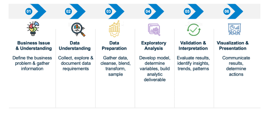
- The truth: The process of moving from data to insights is a multi-step process, and requires ideation & brainstorming, investigation design, question answering, exploration, and communication.
What is the common thread across these three misconceptions? They all create bottlenecks because they all result in an underestimation of the amount of time it takes to execute the insights journey and are often performed manually.

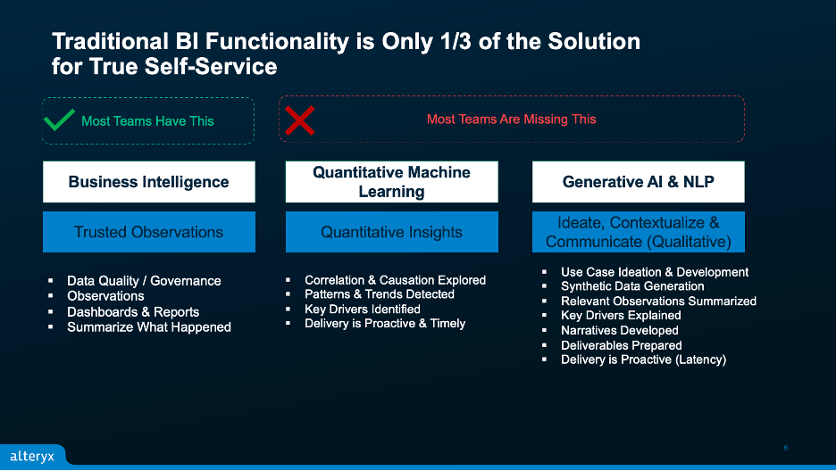
I like to call this the BI Bottleneck – and it’s pretty common for enterprises. But I believe there is a light at the end of the tunnel – and the light is automation. The way we’ve been approaching this has been an incomplete solution to the problem. Dashboards, or traditional BI – whether that is metrics calculations, visualizations, bullet charts, heat maps – whatever you use to summarize and report observations about your business, is only 1/3 of the solution.
Another 1/3 of the solution is quantitative insights. This means taking the analytics a step further to answer some of the most pressing questions about our business. Some examples of this might be correlation and causation, key drivers, or patterns and trends in the data. A big part of this is understanding cause and effect. After all, that’s what so much of business is about, isn’t it? And this is something that can be done manually, with a dozen spreadsheets or a data scientist on call, or it can be automated – and that is key.
Now another 1/3 of the solution is what I call the qualitative insights. I’ve included generative AI in here, not because it is a 1 for 1 with qualitative insights, but because of the profound rise of generative AI over the last year and a half, and where we’ve demonstrated it can make a huge impact on BI automation. For example, we’ve seen success with generative AI as a use case generator – generating valuable use cases for business users based on their role or vertical industry.
Another aspect of this is natural language processing and generation – in other words, using AI and automation to create the narrative. By incorporating these technologies, we can rely on artificial intelligence and machine learning to articulate and explain the stories in our data. And the best part? We are automatically removing biases that might occur when this activity is left to humans.
Augmented BI and analytics
When you put this all together, you’ve got a solution that Gartner likes to call augmented BI and analytics; augmenting traditional BI with automation through AI, to uncover the stories that the data can tell us. An important caveat to this approach is that it does not fully automate everything; there is still data exploration, insight curation, and storytelling that business experts need to do. But we are automating steps that are either typically highly technical in nature and require specialized skills, or highly time-consuming and or tedious to perform when done manually.
So let’s take a look at how AI & Automation can help expedite our misconceptions above, and alleviate the bottlenecks that are slowing down our BI delivery:
Bottleneck #1:
The misconception that we know exactly what we want, and analytics creators can build it.
Solution / Automation Opportunity: Getting Started. Use AI & Machine Learning as our assistant to help guide us to where we need to go. This can happen as a first step, as generative AI can be used to recommend use cases for the end user.
For example, with Playbooks in Auto Insights, users can start with a raw dataset in Auto Insights. Playbooks will recommend use cases tailored to that dataset within Auto Insights. Playbooks will then auto-generate a report of the user’s choice. Playbooks analyzes samples from the dataset’s structure and topic to recommend high-value use cases, moving from raw data to insights and data stories in less than five minutes.
But what if you’re getting started and you don’t even have the dataset yet? Playbooks can also be initiated without a dataset, using a prompt-based interface. The user simply types in their role, company, or industry and immediately receives recommended tailored use cases. With another 2-3 clicks, you get a fully functional prototype, complete with a data model and synthetic data – all in about 5 minutes.
Bottleneck #2:
The misconception that a dashboard has all the answers and that once it is built, we won’t have any more questions.
Solution / Automation Opportunity: Generating (Quantitative) Insights. Use AI & Machine Learning as our assistants to surface patterns, trends, and stories in the data that can be identified without bias or manual intervention. This can happen as soon as the data is loaded into the product and automates what is typically performed manually by analysts or data scientists. This approach to analysis proactively answers common questions from business experts, such as:
- What caused my revenue to increase this month?
- What products 20% of products accounted for 80% of my revenue?
- Which call centers saw the fastest rise in volume this month?
Bottleneck #3:
The misconception that building the dashboard is the entire process.
Solution / Automation Opportunity: Applying Automation to tasks that are highly technical and require specialized skills, or highly time-consuming and tedious in nature. The examples layout several ripe opportunities for automation:
- Automating use case ideation
- Automating prototyping & data model design
- Automating initial build of reports
- Automating pattern, trend, or driver analysis
- Automating correlation analysis
One of the most tedious tasks in the insight generation process is transcribing analysis from one medium of communication to another. How many analysts spend hours of their day copying and pasting dashboards into PowerPoint presentations? From what we have heard, too many. Auto Insights can help with this, too.
For example, Magic Documents leverages enterprise-grade generative Artificial Intelligence (AI) to develop automated communications, synthesizing and delivering trusted analytical insights to stakeholders. Users can leverage the generative text capabilities of GPT models to create communications that are clear, concise, and compelling in either e-mail or PowerPoint format.
