One of the most famous stories of all time is Plato’s “Allegory of the Cave,” a tale about a group of prisoners chained up in a cave. The only reality they know is the shadows cast on the wall as objects and passersby move across the cave’s mouth.
But one day, a prisoner escapes.
At first, the light of the real world is painfully bright. But the escaped prisoner soon realizes that the world outside is the ultimate reality, not the shadows he’s known all his life. One day, the prisoner returns to the cave with this revelation, but the remaining prisoners don’t believe him. They prefer the ignorance and comfort of the shadows.
As enlightening as this story is, imagine if the prisoner had returned with irrefutable proof to back up his arguments. Imagine if he had used hard facts and data to make his case.
While this may have diminished the main point of the allegory — that people are resistant to new ideas — it would have undoubtedly helped his cause.
Much like stories use characters and conflict to convey complex ideas and nuanced realities, data relies on hard facts and numbers to convince and persuade. Combined, they create a dynamic form of storytelling that every data analyst must learn to master.
In this blog, we break down data storytelling and explain how you can use it in your data analytics to communicate your analytics effectively, inform decision-making, and persuade key stakeholders.
What is data storytelling?
There are three elements that comprise data storytelling: data, narrative, and visualization.
- Data is the milieu from which all data stories come from. What happened and why? Or better yet, what will happen, and what should we do about it?
- Narrative is the story used to communicate the results of your analysis. It uses storytelling techniques to convey your data analysis in a digestible and interesting way.
- Visualization is the visual representation of your data story or several of its main points, usually in the form of charts, graphs, dashboards, or other data visualizations.
How to tell a story with data
Data analytics platforms can help you quickly turn raw data into actionable insights, but to convey those insights effectively, you’ll need to tell a story. To do that, you’ll first have to understand the core elements of a narrative: characters, conflict, and resolution.
Characters
Your characters are who the story is all about. Often, there’s a protagonist (the main character or hero) and an antagonist (someone or something actively opposing the protagonist). Remember: your main character is a proxy for your audience. The more your audience identifies or cares about the main characters, the more they’ll empathize with their conflict and, in turn, feel invested in a fitting resolution.
Conflict
Conflict is the struggle between opposing forces or characters. It can be internal (for example, conflicting thoughts or desires) or external (for example, a clash between two or more characters or a character against some force, such as nature or society). Without conflict, there is no story — as there would be no need for a resolution. Put another way, if everything is perfect with your business and/or customers, there would be no need for action!
The equally vital counterpart to conflict is stakes. It asks, “So what?” Why does this conflict matter? For example, if the conflict of your data story is a competitor gaining market share, then the stakes are your business’s success. The higher the stakes, the more compelling the story.
Resolution
The resolution is the story’s ending. Did the protagonist overcome the conflict, or did the opposing characters prove too great a force? The best resolutions are all about transformation — a character changing due to what they know now that they didn’t when the story began.
The benefits of data storytelling
One of the earliest and most famous examples of data storytelling came from the 1854 London outbreak of cholera. Physician John Snow, created data visualizations to convince others that cholera was spreading through the water.

Source: National Geographic
Dr. Snow drew black bars in the locations of every death caused by cholera, and it became incredibly clear from his chart that the deaths were more concentrated around a water pump on Broad Street.

Source: National Geographic
After he made his case, the pump was closed, and cholera cases steadily declined. Let’s break this down a little further:
- The characters in this data story were John Snow, the citizens of London, and the local authorities
- The conflict was the cholera epidemic taking lives and the vital need for evidence to prove the disease’s source and persuade the local authorities to take preventative action
- The stakes were continued loss of human life, including community members and loved ones
- The resolution was the closing of the pump by local authorities and the decreasing rates of cholera
John Snow’s data visualization made an irrefutable case for shutting down the pump (the desired resolution and action), revealing two key benefits of data storytelling: comprehension and persuasion.
- Comprehension. Thanks to the visualization, local authorities and other physicians were able to quickly understand what was happening much faster than if Dr. Snow had tried to relay his findings verbally.
- Persuasion. This deeper understanding led to swift and efficient action.
Best practices and key considerations for data storytelling
1. Know your audience
When telling a data story, make sure you understand your audience, including their unique cares and concerns. Is your audience a group of executives concerned about profitability and ROI, or perhaps the customer success team concerned with customer churn? Crafting your story with your audience’s concerns in mind will make sure it’s more compelling and relevant.
2. Define your objectives from the start
Has your data revealed a pivotal and necessary action? Are you merely trying to inform your stakeholders or influence change? Crafting your story and data visualizations around the KPIs and metrics that are crucial to the business problem — and which serve your end goal or recommendation — will help you create a more focused and impactful data story. Remember, if you have a recommendation, make sure it’s clear and actionable.
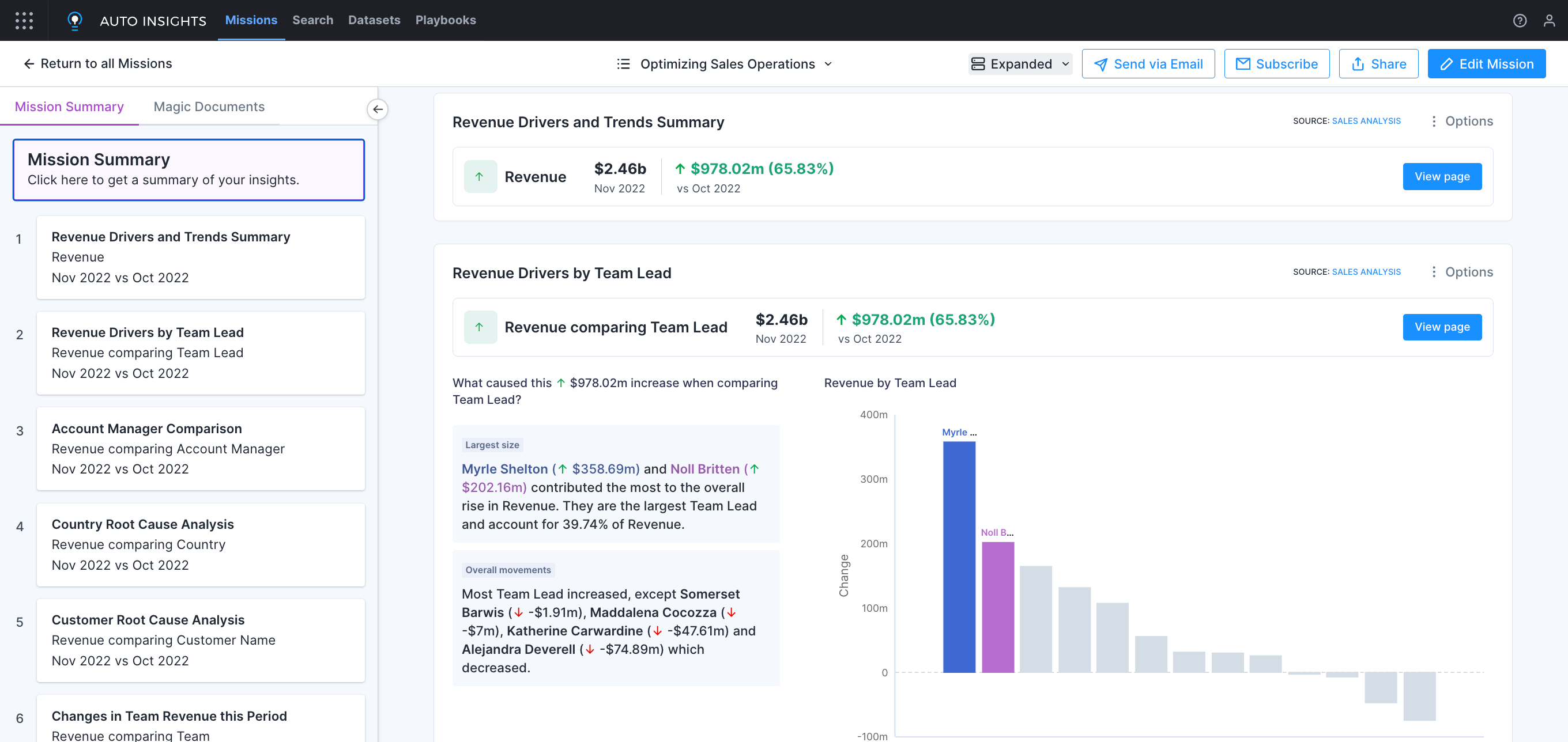
Alteryx Auto Insights can help you automatically surface the most relevant KPIs and metrics for your business problem using root cause analysis. Then, it will summarize and explain your business results in natural language while generating engaging data visualizations — no coding required.
3. Use data visualizations
Your data visualizations are both a medium and an amplification tool for your data storytelling. Make sure to choose the right visualizations that best represent your data (e.g., bar charts for comparisons, line charts for trends, and pie charts for proportions). Make sure to also think like a designer, using color, clarity, and simplicity to create an engaging and digestible visualization.

4. Interact with your audience
Much like an engrossing video game, some of the best stories are interactive. Draw your audience into the story by allowing space for questions or incorporating interactive elements into your dashboard, letting your audience explore the data themselves.
5. Maintain high-fidelity data
If an organization is low in data maturity, it’s less likely to have trusted data, which takes all the teeth out of your story. Maintaining robust data governance practices — including throughout the analytics and data science process — can help increase the reliability and quality of your data and, in turn, the veracity of your stories.
6. Tell the truth
Be cautious of any preconceived notions when starting to construct your data story. You may be tempted to omit certain data or even alter the data to fit your ideal narrative — or meet stakeholders’ expectations — but this can be deeply unethical and misleading. Instead, make sure you only report what the data shows. Be aware of potential biases in your data, and how you can mitigate that bias. Additionally, make sure everyone understands the context of your findings, both where it came from and how it’s been manipulated to arrive at a conclusion. When everyone has a mutual understanding of the bigger picture, it’s easier to create alignment and make effective business decisions.
Automatically find and surface insights with Alteryx Auto Insights
One of the biggest limitations of data storytelling is the time it takes to understand what’s happening in your data and craft a compelling dashboard. Alteryx Auto Insights is a cloud-native analytics solution that uses AI to help data analysts tell better stories in minutes.
Auto Insights can help you instantly understand what’s happening in your data and explain it in clear, natural language. It can even generate intelligent dashboards centered around your business problem — without any coding. With Auto Insights, you can scale your data analytics practice while helping stakeholders understand what’s happening in the data, fostering data-driven decision-making while turning you and your team into master data storytellers.
Interested in telling better data stories? Try the Auto Insights simulation to see how it can work for you.
